Communicating the Struggles of Communication with Non-Digital Typography for a YA Novel
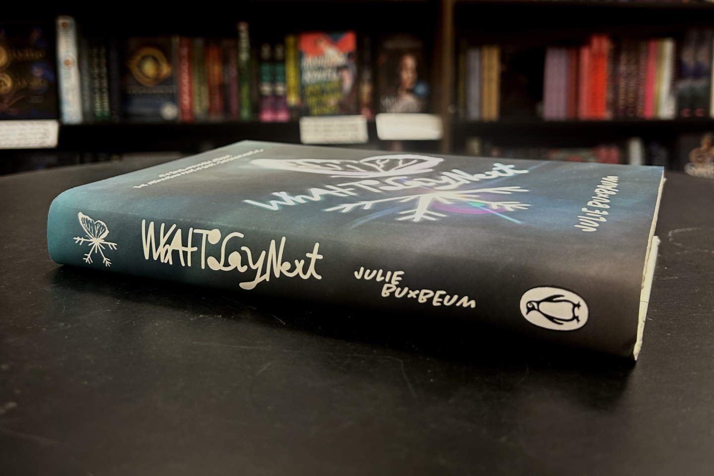
An alternative book cover for Julie Buxbaum's novel "What to Say Next". Focused on visualizing the understanding between two people. The challenge of this project was to make the main title of the book with non digital type which could then be layered on with digital elements afterwards.

The main theme of the book is communication so to illustrate this, I went with a handwritten title with interconnected letters to make it hard to decipher, to force the reader to stop and try to understand. The message of understanding and the love and care it takes for that process is impactful and I wanted to express that through my typography.

After digitizing the sketches for my concept I had the graphics cut into black card stock using a Cricut machine, and then took photographs of the sun beaming through the cuts to get an in camera lens flare. The darker cooler colors reflecting the somber reflective tone of the book, while the light being indicative of the solace that is achieved by the end of the story.
full process video here