Fighting the Stigma towards Mental Health while Celebrating Music, Life, and Energy
The goal of this project was to create a concept as well as marketing graphics and merchandise for We Can Survive Audacy's annual music celebration to raise funding for mental health resources and a celebration of life.
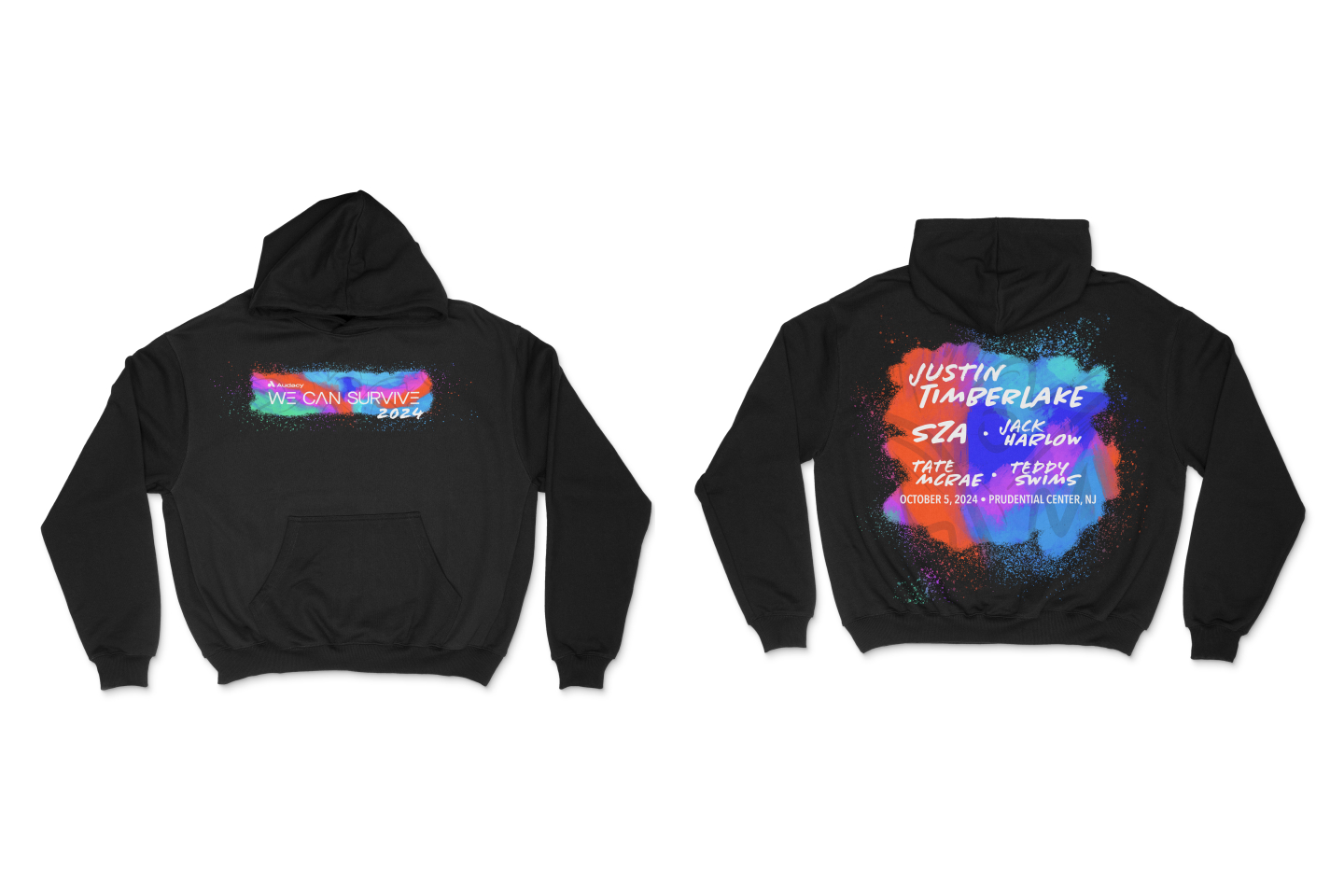
Inspired by Synesthesia, a condition where people have can have a visual sensory reaction to sound, the concept Rough Synesthesia seeks to visualize the feeling of sound and the vibrancy of music. A very rough and gestural style to illustrate the energy, movement, and life of music. Focused more so on the beauty of movement rather than being clean and perfect to go with of mental health awareness.

The backgrounds were illustrated by me by using a jagged dry brush in procreate to lay down colors and then overlaying gestural lines with a smooth gel pen brush in order to simulate the feeling of music.

The artist graphics have the headliners behind a glowing light paint version of the main background to convey the movement of the bright lights typically seen at music festivals. Furthermore, layered on top of the artist photo is a Jackson Pollock styled paint splatter with the info seemingly drawn on top to give a sense of depth and dynamism.

A combination of two handwritten typefaces, Chantal and Flood, were chosen for the headliners to work with the two brush types used for the background and to continue the overall concept. Avenir was used for body copy as to mimic the linear geometric nature of the We Can Survive logo.
A combination of vibrant reds, blue greens and red violets. This unconventional color palette was chosen to convey the theme of the beautiful imperfection of mental health, while still maintaining the exciting nature of a celebration.